Winter is coming, and that means slack times are coming, too. Pick up that slack and put it to work revamping your website with these top tips from five knockout painter websites. While they’re wildly different, they are all effective, and for different reasons. Click, look and learn. Then when those slack times hit, check your notes and make some changes to your site; modern software makes it trivial to update WordPress, Drupal, Joomla or other standard options.
Richard T. Winkler, Inc
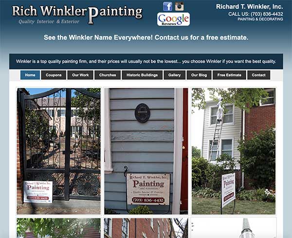
Richard T. Winkler, Inc — We’ll admit it: we’re not wild about the blinking scarlet RESERVE NOW notice, but it does give a sense of urgency. The thing we like about this website is the way it blends the personal and the professional. You know, from the name of the company, the contact info, the photos and videos, that you will be talking to Rich Winkler, a friendly looking fellow who looks as if he was born to wear plaid flannel shirts. The web copy is clearly not professionally written, although it is quite passable. Personal testimonials abundantly sprinkled throughout keep the tone human and one-on-one. If your website can convey half the personality of this one, you’ll be doing well.
Excel Home Painting
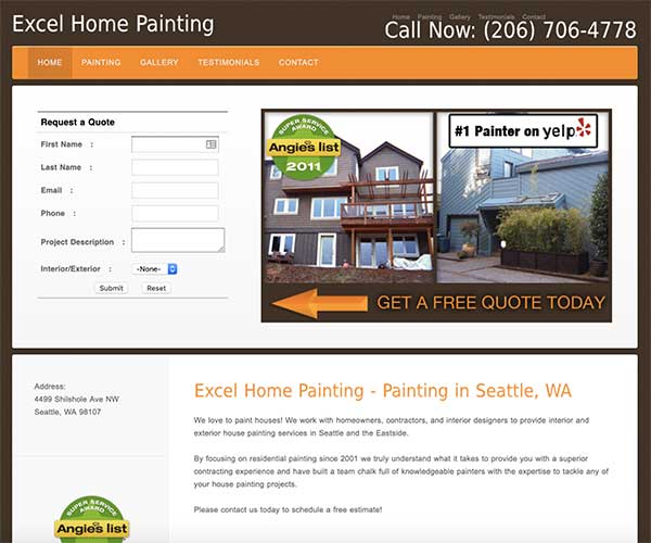
Excel Home Painting — The thing we love about this one is that the call to action, ie Hire Us, is right there at the top of every page in the form of a whole contact form. The site is clean, bright, and modern, and the focus of every single page is that form to fill out and get a free quote. Make it as easy for your customers to get ahold of you.
Painters For A Day
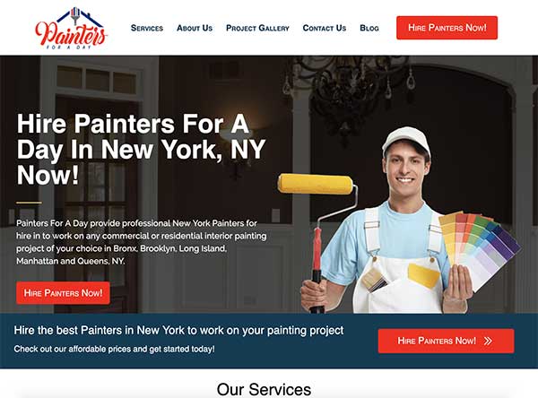
Painters For A Day — The big selling point of this website is the vast amount of information it gets before the customer’s eyes. When you’re serving multiple municipalities from the same website, you do have to have tabs for each location. When you’re a bigger company, you need to convey that with information; a simple four-pager is going to look like you’re hiding something or like you haven’t updated your website in ten years. By keeping the colours light and bright, and dividing the page up with headers, they make it easy to find information, and keep the eye on the page with so many different pieces of information.
Ellison Paint and Restoration
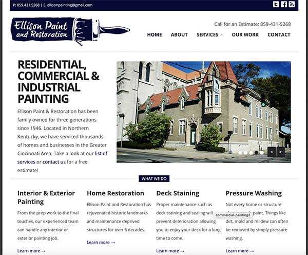
Ellison Paint and Restoration — The word for this website is “classy.” They’ve got a nice, custom-designed logo and have matched their header to it nicely. They’ve gone to the trouble of uploading a favicon that matches. The photographs demonstrate their taste for fine architecture and historic buildings; you know they’ll be able to handle your suburban split-level mock Tudor. All the photos reinforce that aesthetic. None of the buildings clashes with the others. The text information is displayed in easy-to-scan fashion and the gallery is a nice teaser below, encouraging readers to click on the photos and engage with the site. The all-important phone number remains in the header, no matter which page you’re on.
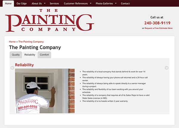
The Painting Company
The Painting Company — Somebody’s web designer really went to town with the reds here. The site conveys a strong, bold impression that also manages to convey sophistication in the way it’s used. The color is used in elements all around the website, from the header to the widgets to sub-headers and artistic flourishes around the site. If you have a trademark color, and a painter should think about it, don’t be shy about making it the trademark of your site as well.


