If you haven’t put as much care into your website as you would put into a storefront, it’s time to start getting serious. It takes your potential customers only minutes to compare every local landscaping company in their area, and the ones that don’t catch their attention immediately are not going to make the final cut. Beyond providing good information about your services and prices, you need a great look and some strong hooks to reel them in.
Sure, that’s all easier said than done, but there are some great websites out there for you to use as a guide. We’ve tracked down some of the best landscaping websites online, just for you. Let us introduce you to some gorgeous landscaping websites, and explain how you can model your own website around their success.
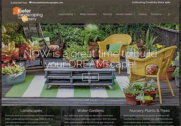
Kiefer Landscaping and Nursery
Kiefer landscaping is a great site with plenty going for it. The clever bark background and the complementary earth tone colors immediately create a soothing outdoor effect. Attractive outdoor pictures cascade back in forth at the top, and several galleries are conveniently provided to the side for visitors who want to see more. Even the fonts seem friendly and outdoorsy.
What makes this website great is the overall feeling it creates. All of these elements working together charismatically suggest that the people behind this landscaping company have a strong understanding of their work—and they love it.
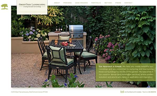
Green Tree Landscaping
Here’s a great landscaping website from Los Angeles that proves that you don’t need a bunch of fancy widgets to look good. This site uses a little to do a lot. One of the great things about this website is how the images are used to create large attractive center pieces against the plain white background. If the extravagance of some of these websites has been a little intimidating to you, you’ll be glad to know that simple and professional can still go perfectly together.
The use of images should be your biggest takeaway from this great landscaping website. They’re attention grabbing, good looking and encourage further navigation into the website. It’s already well understood that online consumers love strong images, and this is definitely the best way to meet their needs.
Of course, not everything about the design is useful to businesses building their first website. In place of content on the home page, the designer here has included just a small blurb. That’s a risky strategy for up-and-comers, because search engines currently respond better to written content. However, that’s certainly a strategy to consider when you have the attention you need from search engines.
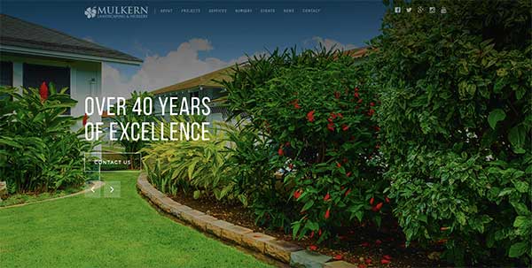
Mulkern Landscaping
The Mulkern landscapingwebsite is great for many of the same reasons as the Kiefer landscaping site. There is obviously great use of images and a strong color design that perfectly matches it. However, we do see some very different color choices here. The calm but sunny look achieved by Mulkern is very different from the green+brown palette used by most landscaping websites, but you’ll probably agree that it’s still very effective.
Mulkern has also developed great copy for their homepage and other pages. The home page content stresses reliability and environmental responsibility, which goes along very well with the sincere-looking design.
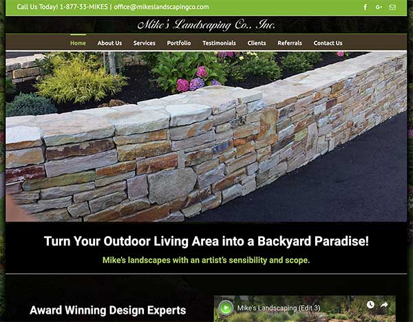
Mike’s Landscaping Co.
Very few websites on this list can approach Mike’s when it comes to jaw-dropping beauty. The entire background image is one huge high-definition landscape. It’s also a landscape that really speaks to the skills that this team brings to the table. Once you’ve seen that this team can do something like this, there really isn’t much you have to read to be convinced.
The equally image-focused menu is also very well-executed. More stunning photos slide back and forth here, and the background opens up behind the transparent text fields. If there was anything to complain about on this website, it would be that this makes some of the content a little hard to read. However, if you make your decisions based on a landscaping team’s gallery work, this website has probably already hooked you.
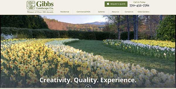
Gibbs Landscape Company
Gibbs Landscape Company has one of the best websites in the entire business. It’s no wonder that they are the only local website that shows up when you do a global google search for landscaping companies. Just one look and you already have a very strong idea of what they’re doing right. In this case, the content and the images are both expertly used.
Immediately upon entering the site, you see amazing photos, with a lot of variety to them. There are even some playful planning photos that show the stage from drafting to landscaping. Clear titles are front-and-center, and home page includes several concise nuggets of content including blog blurbs and reviews.
The power of the images is self-evident, but to see the power of the content, you really have to take a look at the other pages. Gibbs uses panels to set content apart, allowing gorgeous pictures to flow in and out of the background. Even just looking around the site is a pleasing experience.


