If you haven’t put as much care into your HVAC website as you would put into a storefront, then you’re not taking advantage of one of the most powerful marketing tools available to you. It takes your potential customers only minutes to compare every local HVAC company in their area, and those that don’t seem professional or have enough information are likely to suffer in comparison. Beyond providing solid information about your hours, services and prices, you need to confirm your company’s legitimacy by including pictures and success stories.
Creating great HVAC websites can seem daunting to someone who hasn’t done it before, but luckily there are some great examples out there to lead the way and provide ideas. We’ve tracked down some of the best HVAC websites online, just for you. We’ll explain how you can model your own HVAC website around their success.
Wheeler’s Plumbing, Heating and Cooling
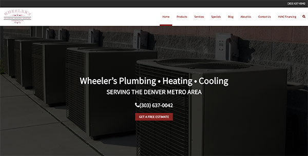
Wheeler’s Plumbing, Heating and Cooling is a professional-looking HVAC website with all of the information a customer might need front and center. The imagery is inviting and conveys comfort and confidence. The hours and contact information is right up on the top, and persists as the images change to display Wheeler’s different services.
Further down the homepage they cover all of the areas a customer might care about: they offer a cost calculator, have information about a referral program, and display seasonal specials and customer testimonials. This is an HVAC site that’s sure to inspire confidence.
Connor Air Conditioning and Heating, Inc.
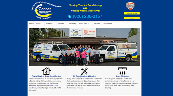
This website from Connor Air Conditioning and Heating in Los Angeles isn’t flashy. Instead it’s straightforward, creating a connection with potential customers by putting its staff at the forefront. In addition, the offered services are very clearly laid out (heating and air conditioning, duct cleaning) and a customer can contact Connor by clicking on the button on the top right or calling the phone number that is front and center.
They’ve also included a brief “about us” section at the bottom of their homepage which demonstrates their commitment to the community since 1976. Their credibility is further reinforced by the badges of certifying organizations at the bottom of the page–a must-have for HVAC websites.
Mannix Heating & Cooling
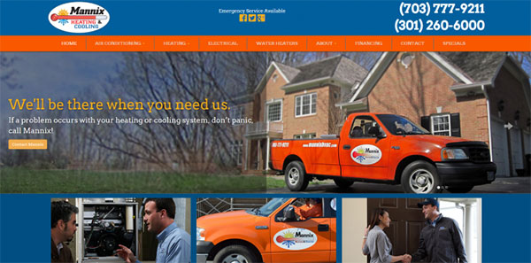
The Mannix Heating & Cooling website is striking. There is obvious great use of images and a strong color design that perfectly matches it. However, we do see some very different color choices here. The vibrant look achieved by Mannix is very different from the palette used by most HVAC websites, but you’ll probably agree that it still comes across as professional and trustworthy.
While Mannix relies heavily on imagery, they’ve also incorporated social media to great effect. Note the “Emergency Service Available” section at the very top with links to their Facebook, Twitter and Google + profiles, where you could reach out for immediate service in a pinch.
Preferred Home Services
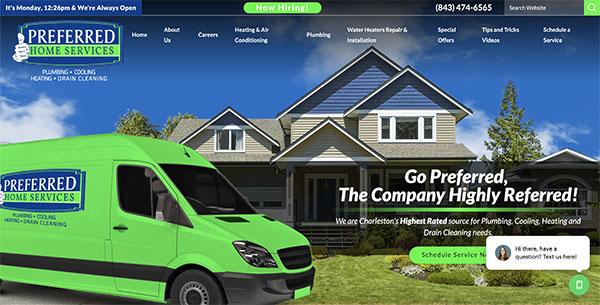
Preferred Home Services are serious about your home, and they make that clear by their “hero image” on the home page. This HVAC website gives you everything you need to make a service decision. The entire background image is one huge high-definition model home shot. This is overlaid with a form that allows a customer to enter their service request information on the spot, and the image carousel highlights testimonials and service specials.
The top navigation is also very well-executed. It includes a link to more information on all of the major service categories that Preferred offers, as well as access to their advice-rich blog and coupons. Preferred Home Services has an inviting yet call-to-action-focused site, the best of both worlds.
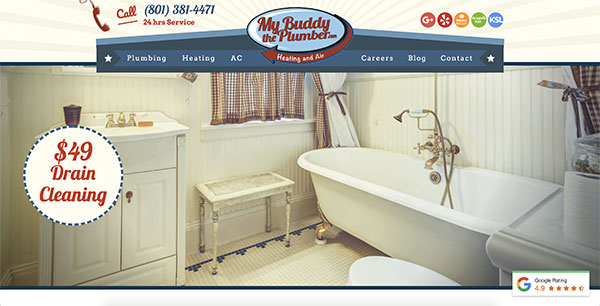
My Buddy The Plumber
There are a lot of different types of HVAC websites out there: informative, visual, or straighforward. But none of them have the personality and overall appeal of My Buddy The Plumber, which serves the Salt Lake City, Utah area. My Buddy The Plumber draws from a sense of humor and nostalgia to connect with customers, expertly using graphics to draw the eye. They have all of the necessary calls to action (phone number and “book now” button) and a photo of staff, but have also added a video to create an additional draw.
Another website bonus: clicking on “The Tankless” leads you to a page with information on the benefits of tankless water heaters and even includes an infographic. Now that’s making the most of your HVAC website!


