Many people go looking for their maid services online. Is your website competitive with all the others in your area? If you’re working on only your first or second website, you may not really be sure. There are definitely right and wrong ways to build a maid service website and the difference between doing it wrong or right is a whole lot of customers. Fortunately, you don’t have to go looking far and wide for some examples on how to do it right. We’ve gathered a bunch of the best maid service websites you can find online. We’ll tell you what they’re doing right so that you can develop some ideas to make your own website a lot better.
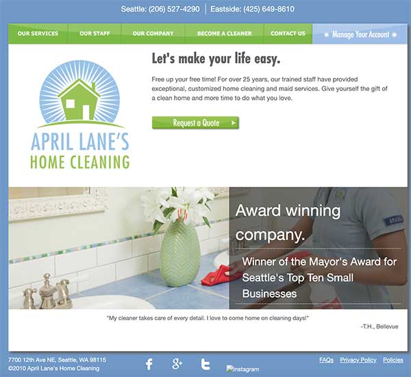
April Lane’s Home Cleaning
April Lane’s Home Cleaning — We always like to start off with something simple. Yes, there are some amazing websites out there, but fancy developing is not what it takes to draw in customers. Making your website simple, clean and easy to use is worth plenty. Here’s a website that does it very well. Nothing about the design is distracting, and it’s as easy as anything to get to the exact page you need or request a service call. At the very least, your website should be as clear as this one.
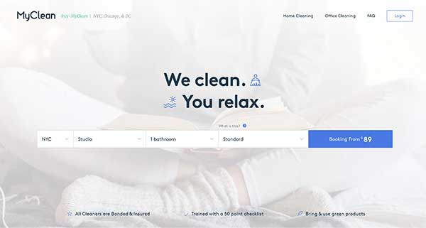
My Clean
MyClean — Here’s a website with a bold strategy that appeals to the busy. Remember that most visitors will check out 2-3 websites before they make their decision about which service to order. The only way around that is to reel them in with a powerful hook. This website has a great one. You barely even notice there is content, but every question you could ask about the service is covered in the front-and-center service request. This is exactly what the exhausted shopper is looking for. Give your visitors a chance to choose you first by making it as easy for them as possible.
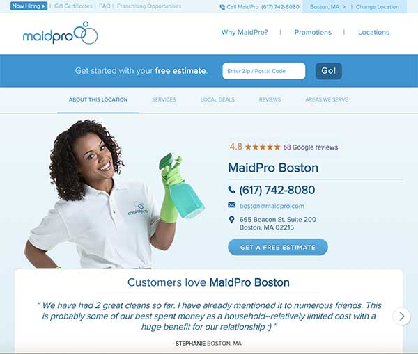
MaidPro Boston
MaidPro Boston is in a different style than some of the other websites we looked at. Where information can be found immediately on the two previous sites, Maidpro is a site that requires a few seconds of investment. Of course, this isn’t a bad thing. There’s more than one way to design a website, and the use of human images is something that’s been very successful with many advertisers. Notice that even though the website is much longer, a lot of the most important information is gathered near the top.
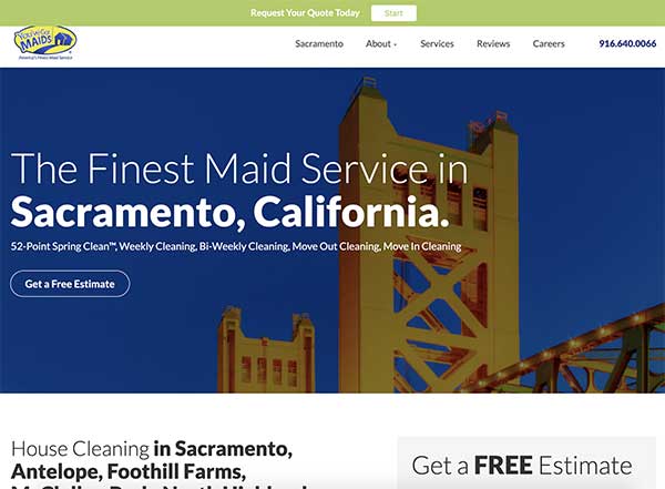
You’ve Got Maids
You’ve Got Maids — This Sacramento maid service website starts to up the game as far as developer muscle over the previous websites we showcased. The commercial will probably be ignored by most visitors, but those that do put in the time are probably going to convert better. The order form is easy to find and right below the main content. This snazzy look is a great model if you want something with a little more polish.
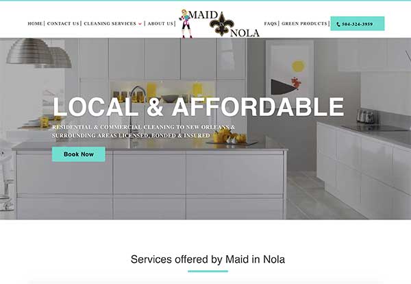
Maid in Nola
Maid in Nola — We included this website as an example of where to go all out if you feel that’s your best course of action. This website uses massive photos of sparkling clean rooms, and some image-navigated menus to help visitors get where they need to go. The great use of images continues on all the other pages. This kind of design should hook a lot of people. Consider it if you have the budget or the know-how.


