If you’re in the computer repair business, your customers are going to be holding your website to a higher standard. You’re going to want to meet every basic expectation that customers have for a business website (professional, understandable), and then maybe show off a little. If you haven’t even met the basic standards, you can be sure that it’s costing you some business. Spruce up your website by taking some pointers from the people who do it the best.
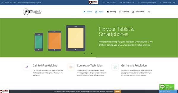
ItSatisfy
ItSatisfy — We always like to start things off simple for the first website on the list. After all, you don’t need a massive budget and a crack team to pull off a website that gets you orders. Sometimes simple and clean is the way to go, and the people at ItSatisfy have pulled it off. In short, they gave you everything you want with no clutter. Consider this a great model for your own website.
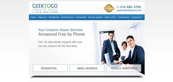
GeektoGo
GeektoGo — Here’s a website that’s playing the professional angle a little harder than our last example, but it’s still done using the same style. Nice clean white background with pictures that clue you in instantly, and one easy click to whichever type of service you were looking for when you dropped by. You’ll notice the copy is neat and minimal. It’s available if visitors want questions quickly answered, but also completely out of their way if they’re looking to call as soon as possible.
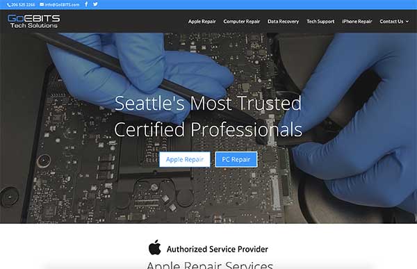
E-Bits PC and Laptop
E-Bits PC and Laptop — Yes, simple and clean is an effective strategy for building a website, but you could stand to do a bit more if you wanted to stand out from the crowd. E-bits website out of Seattle has a lot of interesting things going on. The background is broken up by some attractive skyline photos, and all the service links are bordered in bright colors. You find some photos of real customers at the bottom. This is an effective way to create a human connection with your visitors. That’s very important for building trust.
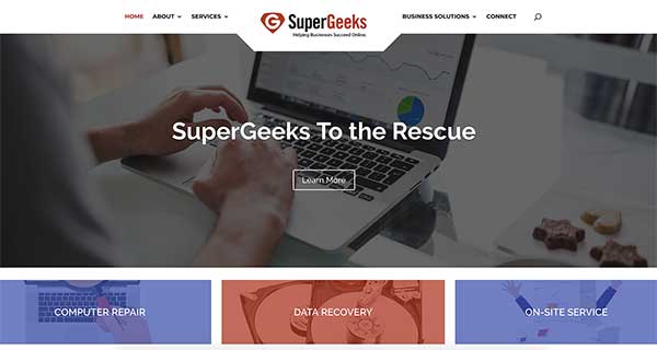
Supergeeks
Supergeeks — Now, here’s a website that takes a more interesting route to giving customers the information they need. Each service they offer is represented by a human expressing their need of a certain service. There is little copy, but it is clear and written humorously. Visitors will be easily convinced to work a little harder to find out what they want to know. Excellent information is provided once the visitor clicks on the portrait for their particular problem.
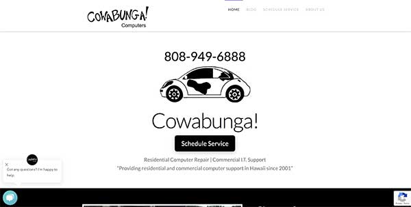
Cowabunga Computers
Cowabunga Computers out of Honolulu has the best website on this list. Like the other websites we’ve listed, it doesn’t take any time at all to figure out who they are and what they’re about. Unlike the other websites, they’ve packed theirs with a bunch of attractive and interactive features. The graphic-style of design means the page rearranges itself to whatever the customer wants. All the content is nicely categorized to make it easier to read. If you want to do something with your website that will set you apart, consider creative websites like this one a perfect model.


